
Making Boxplots More Effective
Using markers, text, and selective data to improve your visualizations
Box plots are a personal favorite of mine. They can show a great deal of information in a relatively straightforward and comprehensible manner. But because of the amount of information they convey, it is easy to create a box plot that is an unintelligible mess. Here are some tips on how to improve your box plots to make them more streamlined and effective.
Note: this article assumes a basic knowledge of python, matplotlib, and seaborn to produce data visualizations.
Color and Palettes
This one seems obvious, but it is easily overlooked, particularly because seaborn makes it so simple to make a decent looking boxplot. Here is some example code and a visualization of data analyzing the gross revenue of movies:
director_graph = sns.boxplot(data=director_df,
                             x='num_movies_directed',
                             y='worldwide_gross',
                             # omit outliers
                             showfliers=False)

director_graph.set(xlabel='Number of Movies Directed',
                   ylabel='Worldwide Gross (USD)',
                   title='Worldwide Gross by Director Experience')
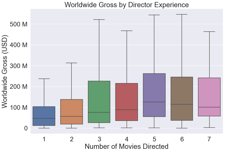
This graph looks fine, and uses clear colors to distinguish between the different categories. You can also switch to another palette like one of these from the seaborn documentation. But what if you want to highlight certain categories or ranges? The following code creates a custom palette where num_movies_directed > 3 is blue to highlight this range of values:
# create color palette to highlight key categories
color_pal = {count: 'b' if count >= 3 else 'r' for count in
             director_df['num_movies_directed'].unique()}

director_graph = sns.boxplot(data=director_df,
                             x='num_movies_directed',
                             y='worldwide_gross',
                             # omit outliers
                             showfliers=False,
                             palette=color_pal,)
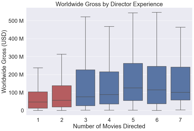
This small change allows you to further reinforce the key elements of the visualization, making it easier for viewers to see what you want them to.
Text
Text is a great way to include numeric data or other key information to a graph, but putting text on an already busy plot can turn the visualization into a jumbled mess. Instead, it is best to only use text on a single key data point when you wish to highlight it over the others. One good way to do this is as follows. Here is the code and visualization for a typical boxplot:
genre_count_graph = sns.boxplot(data=full_movie_data,
                                x='genre_count',
                                y='worldwide_gross',
                                palette='flare',
                                # omit outliers
                                showfliers=False)

genre_count_graph.set(xlabel='Number of Genres',
                      ylabel='Worldwide Gross (USD)',
                      title='Worldwide Gross by Genre Count')

Now if we add the following code to the plot, it will include text with the median values for each category.
# get list of mean values and graph positions for text
medians = full_movie_data.groupby(['genre_count'])['worldwide_gross'].median()
vertical_offset = full_movie_data['worldwide_gross'].median() * (-0.1)

# include mean value as text for each category
for xtick in genre_count_graph.get_xticks():
    genre_count_graph.text(x=xtick,
                           y=means[xtick+1] - vertical_offset,
                           # change mean format to match y-axis
                           s=(str(round(means[xtick+1] * 0.000001)) + ' M'),
                           horizontalalignment='center',
                           size='x-small',
                           color='w',
                           weight='semibold')

While a reader can determine a rough numeric value by using the labeled y-axis, by placing text on the graph you draw the reader’s attention and highlight this key piece of information, ensuring that it will not go unnoticed.
Outliers
Outliers are something that typically give people fits when trying to create a plot that is both fully explanatory and easy to parse. This is because outliers are often an important part of the dataset, and cannot be responsibly ignored. Including them, however, often makes a plot impossible to read. For example, here is the exact some plot as above, but with the outliers included:
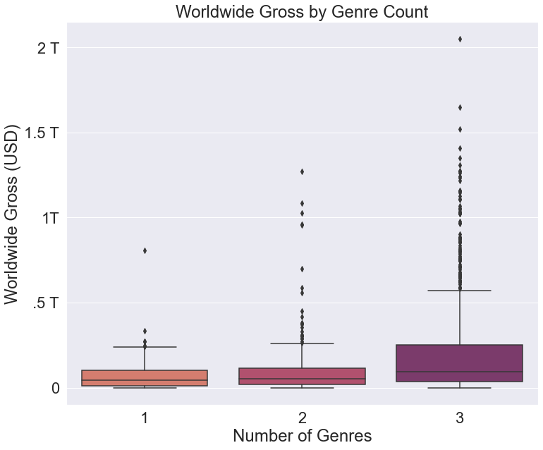
This graph does a great job of displaying the relative number of outliers in each category, but it makes comparing the boxes impossible. There are too important to the data set to exclude them entirely, so what is the solution? One answer is to include alternate datapoints that communicate the same information that the outliers do. This can be done using markers.
Specialized Markers
If outliers are such an issue, what can we use to allude to the presence of outliers? Thankfully, seaborn includes an optional argument in their boxplots called showmeans. Setting this to True will place a marker at the mean value for each category, like so:
genre_count_graph = sns.boxplot(data=full_movie_data,
                                x='genre_count',
                                y='worldwide_gross',
                                palette='flare',
                                # omit outliers
                                showfliers=False,
                                # include means
                                showmeans=True,
                                # format mean markers
                                meanprops={"marker":"o", "markerfacecolor":"white", 'markeredgecolor':'black'})

genre_count_graph.set(xlabel='Number of Genres',
                      ylabel='Worldwide Gross (USD)',
                      title='Worldwide Gross by Genre Count')
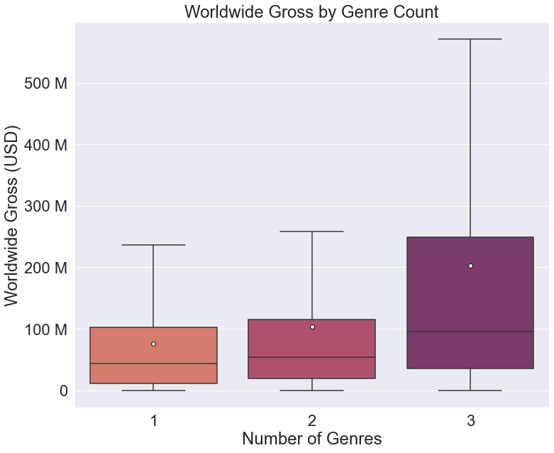
Now we have a legible graph that provides readers with a way to see the relative weight of outliers on the data. Because the mean values are more affected by outliers, the greater the distance between the mean and median value, the greater the weight of outliers on the data. There is an issue, however. There is no immediate way for a reader to identify that the markers represent the mean values unless they are familiar with seaborn boxplots. This leads to the next key point: legends.
Legends
When creating scatterplots, seaborn is good about automatically filling a legend with all the necessary information. In fact, in many cases you don’t even need to declare the legend, as it is included by default:
tips = sns.load_dataset("tips")
sns.scatterplot(data=tips, x="total_bill", y="tip", hue="time")
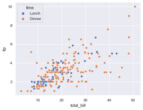
Seaborn does this for relational plots like scatter plots because you will almost always want this information included. But when we try to add a legend to the categorical box plot we created earlier, we see that the mean marker is not included:
genre_count_graph = sns.boxplot(data=full_movie_data,
                                x='genre_count',
                                y='worldwide_gross',
                                palette='flare',
                                # omit outliers
                                showfliers=False,
                                # include means
                                showmeans=True,
                                # format mean markers
                                meanprops={'marker':'o',
                                           'markerfacecolor':'white',
                                           'markeredgecolor':'black'})

genre_count_graph.set(xlabel='Number of Genres',
                      ylabel='Worldwide Gross (USD)',
                      title='Worldwide Gross by Genre Count')

# add legend
plt.legend()

Instead of a legend we get an error: 'No handles with labels found to put in legend.' So how can we include a reference to the mean marker in our legend? Matplotlib allows us to reference and access the different parts of the legend as seen in the documentation here and here. It’s worth learning how to better manipulate the legend, but it is a lower order concern for many users. Instead, I have a straightforward method that does not require detailed access to the legend features. Simply plot an empty scatter plot and format the markers to match your mean markers. Here is the code for the empty scatter plot:
plt.scatter(x=[], y=[], s=100, marker='o', color='white', edgecolor='black', label='mean')
Now when we add a legend, it automatically includes the marker from the scatter plot, without actually plotting any additional points:

Now you have a quick and easy way to add whatever kind of markers you may need to a legend, regardless of the type of graph. This is not the most elegant method, but it will suffice for the vast majority of use cases.
Here is our earlier example in full, with mean markers, text, and a legend to provide a clean, yet detailed, visualization of the data:
genre_count_graph = sns.boxplot(data=full_movie_data,
                                x='genre_count',
                                y='worldwide_gross',
                                palette='flare',
                                # omit outliers
                                showfliers=False,
                                # include means
                                showmeans=True,
                                meanprops={'marker':'o',
                                           'markerfacecolor':'white',
                                           'markeredgecolor':'black'})

genre_count_graph.set(xlabel='Number of Genres',
                      ylabel='Worldwide Gross (USD)',
                      title='Worldwide Gross by Genre Count')

genre_count_graph.set_yticks(genre_count_graph.get_yticks()[1:-1])
genre_count_graph.set_yticklabels(['0', '100 M', '200 M', '300 M', '400 M', '500 M'])

# get list of mean values and graph positions for text
means = full_movie_data.groupby(['genre_count'])['worldwide_gross'].mean()
vertical_offset = full_movie_data['worldwide_gross'].mean() * 0.15

# include the mean value as text for each category
for xtick in genre_count_graph.get_xticks():
    genre_count_graph.text(x=xtick,
                           # ignore first xtick set at 0
                           y=means[xtick+1] - vertical_offset,
                           # change mean format to match y-axis
                           s=(str(round(means[xtick+1] * 0.000001)) + ' M'),
                           horizontalalignment='center',
                           size='x-small',
                           color='w',
                           weight='semibold')

# plot empty scatter graph to include mean marker in legend
plt.scatter(x=[], y=[], s=100, marker='o', color='white', edgecolor='black', label='mean')
plt.legend()

Now you, too, can feel that much more confident in your ability to produce clean, effective box plots using seaborn. Let me know if you have any other tips you find useful, or if you want to see more like this!